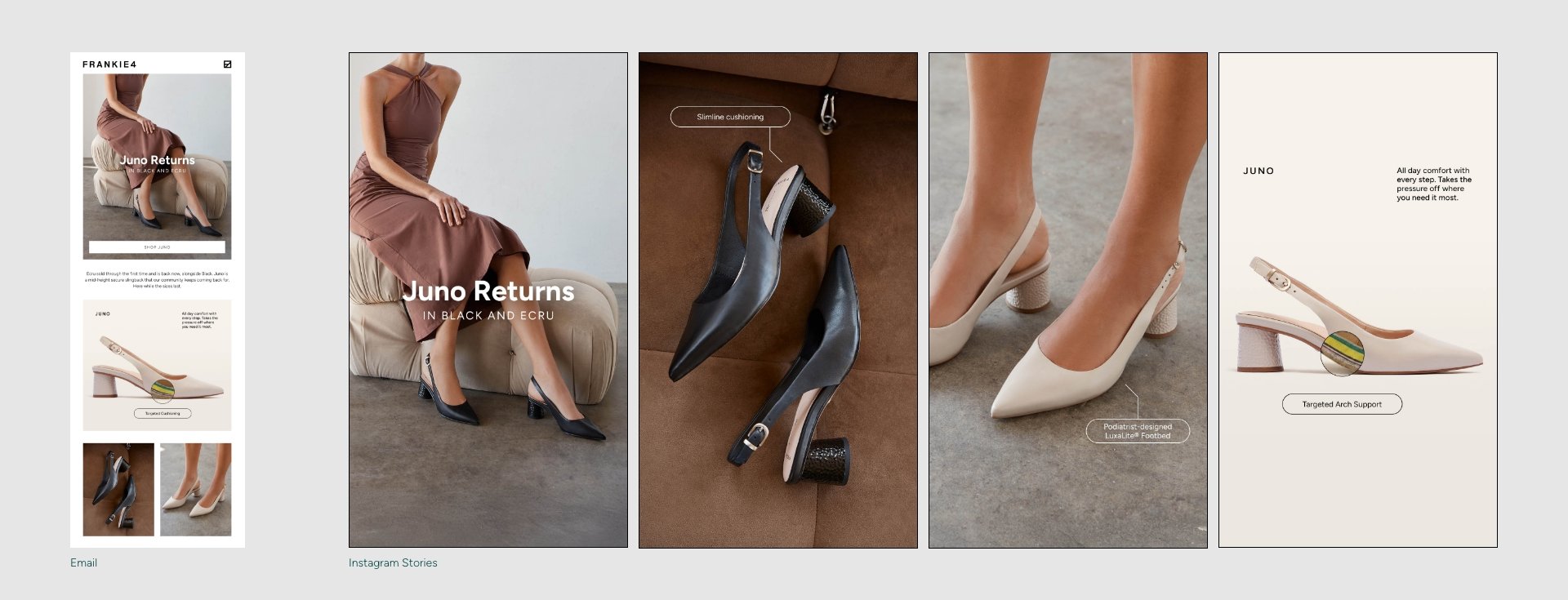
Brand Identity Refresh
FRANKIE4 Footwear
FRANKIE4 is an Australian women’s footwear brand that recently decided to refresh their brand identify to cater more to a specific section of their audience. In the past, the brand focused heavily on lifestyle campaign imagery designed to attract customers aged 30-50 years old. Examining customer data revealed that 80% of customers were actually women over 45, with most being in their 50s-60s. Therefore, FRANKIE4 decided to lean heavily into the technology behind their footwear to appeal to the functionality and practical needs of their older customer base.
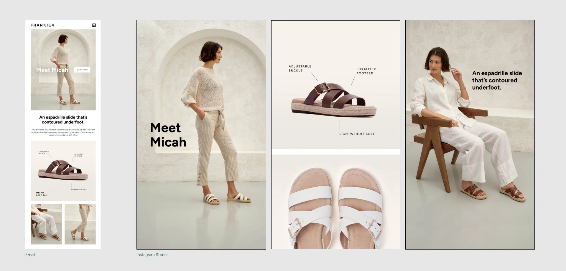
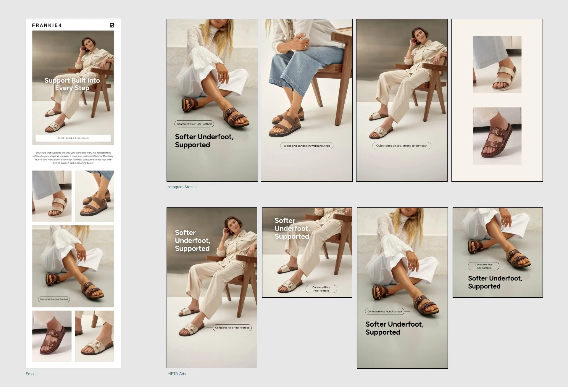
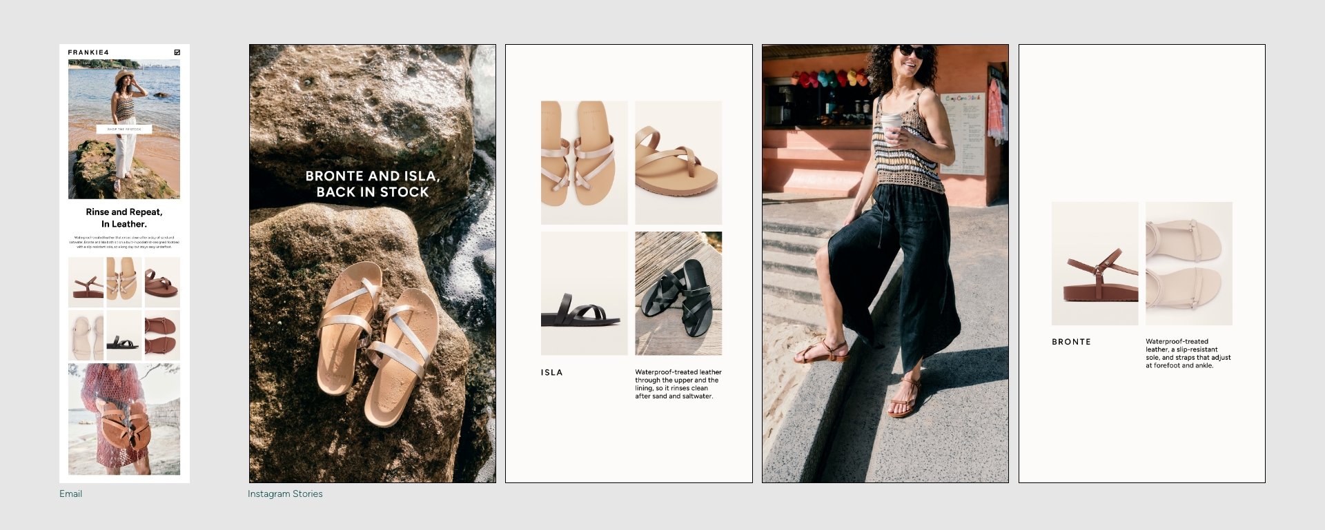
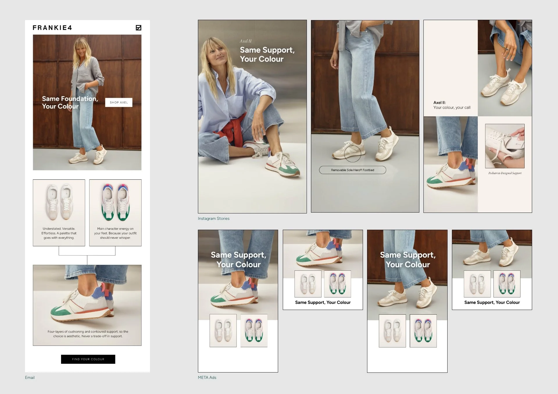
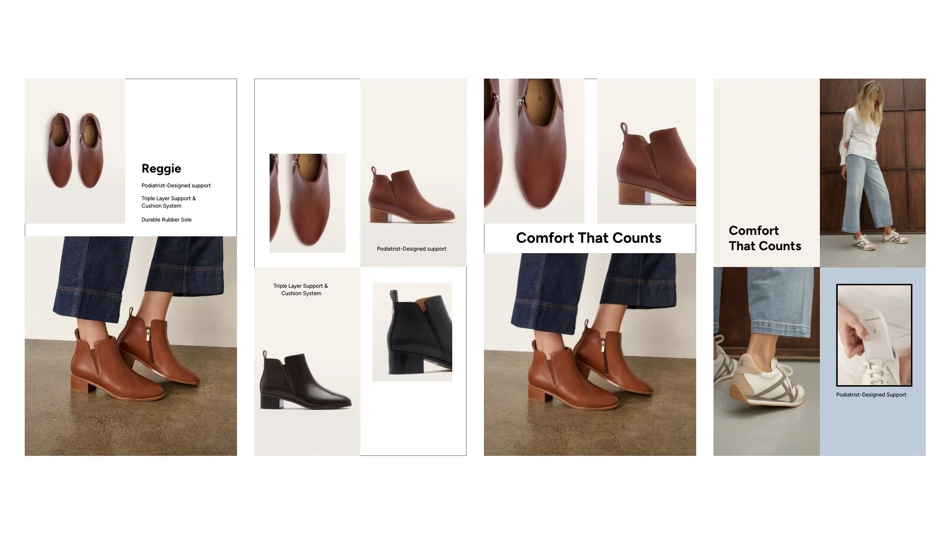
The design team and I were asked to bring the brand into an identity more closely aligned with wellness brands, using visuals that supported the footwear structure more so than the styling. Working alongside our Design Lead and Senior Graphic Designer, I took point on creating the look and feel for potential Meta and Social posts, focusing my designs on the use of stockshots, line elements, and data points to highlight the wellness and technology elements and also reflect the decrease in lifestyle photography availability. As a team, we also rearranged the font hierarchy to push a bold sans serif as the hero typeface, aiming to capture attention and increase legibility.
Project
Concept and execute a refresh to the FRANKIE4 brand identity to reflect a more accurate customer base
Role
Graphic designer (working alongside fellow designers and receiving guidance from the Director of Marketing)
User Group
Existing and potential FRANKIE4 customers, aged 45-65
Concepting and Iteration
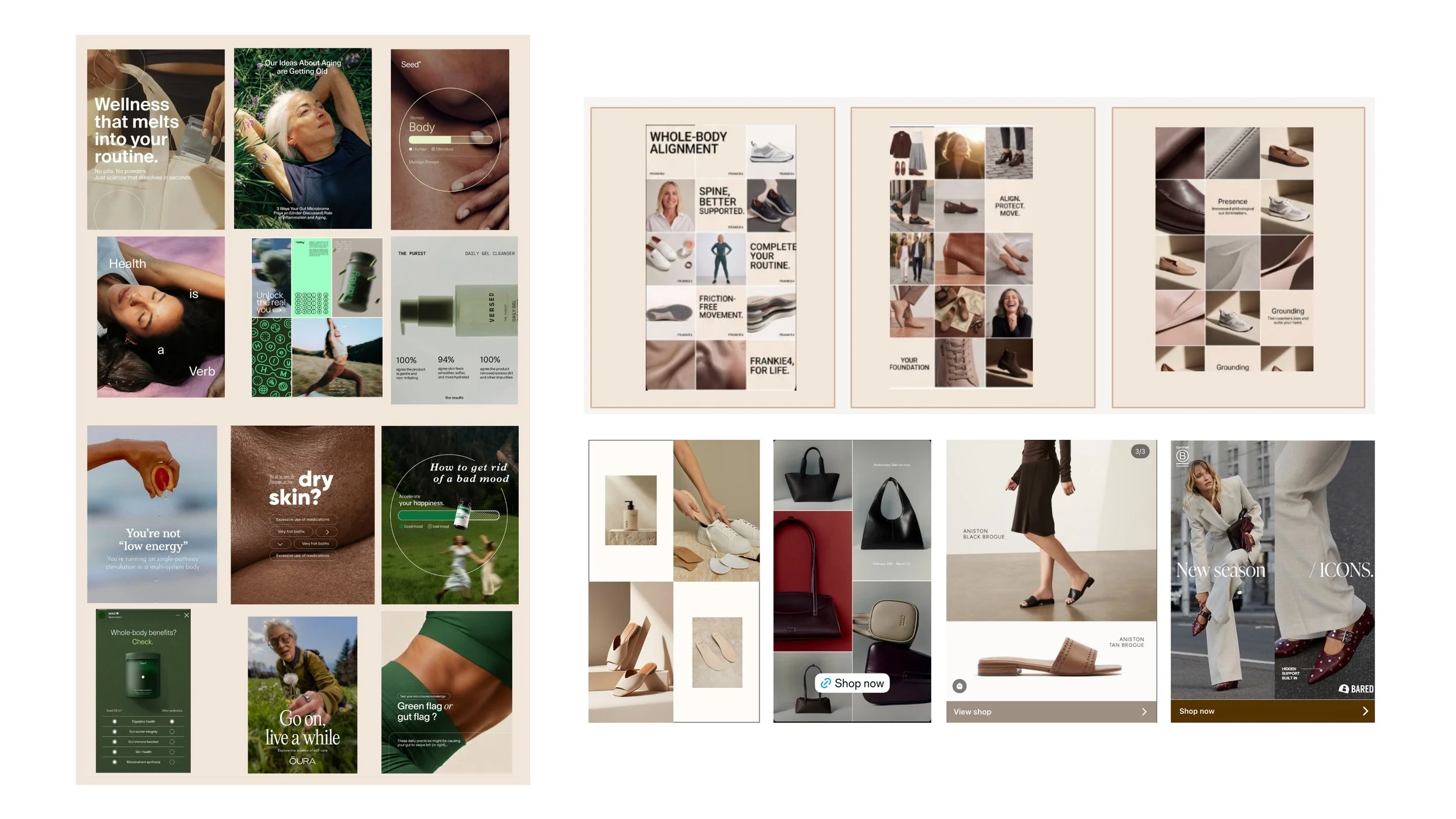
Creative references and visual direction: Wellness-adjacent, clear text overlay that feels intentional. Premium and aspirational.
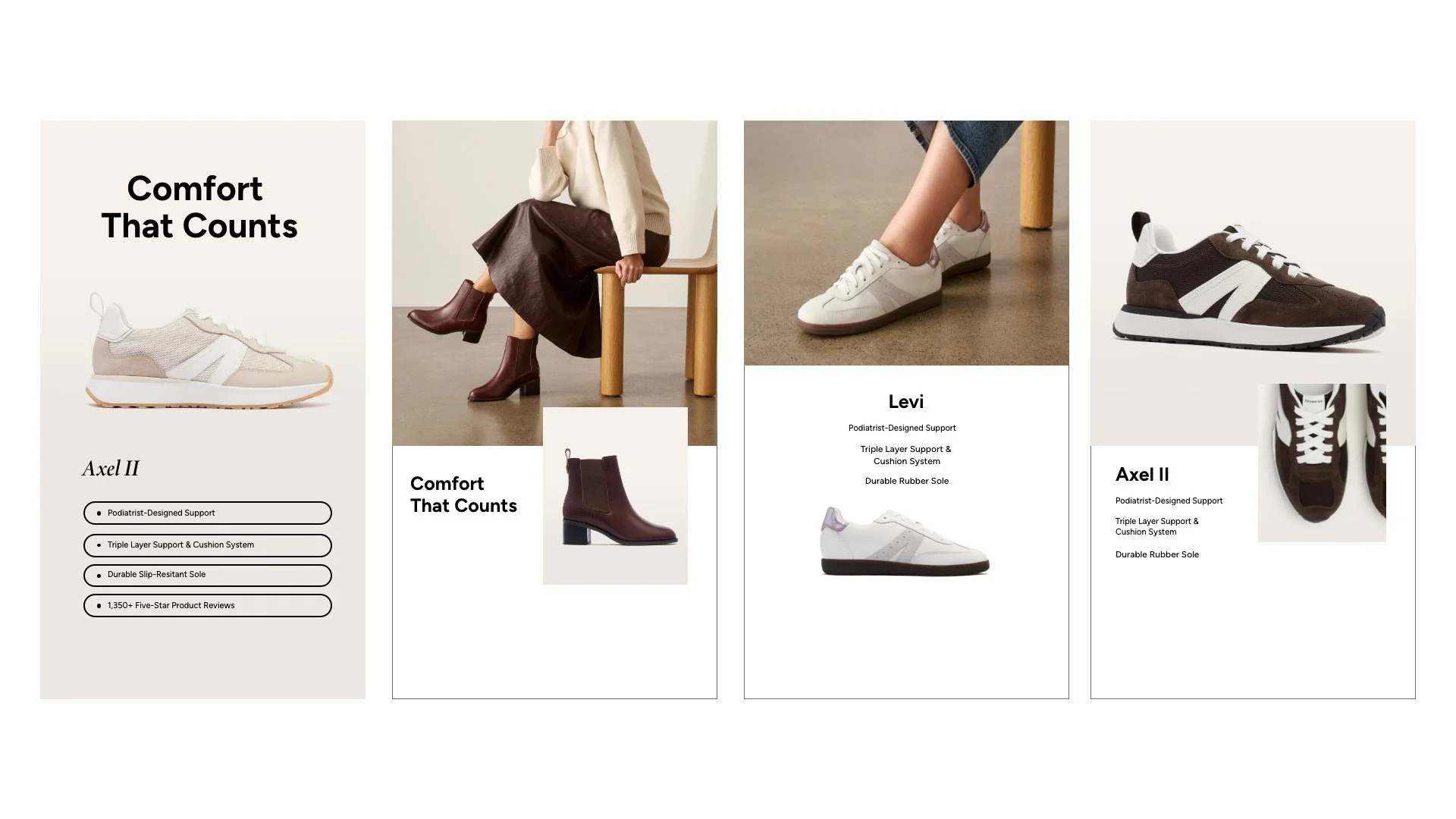
Iteration
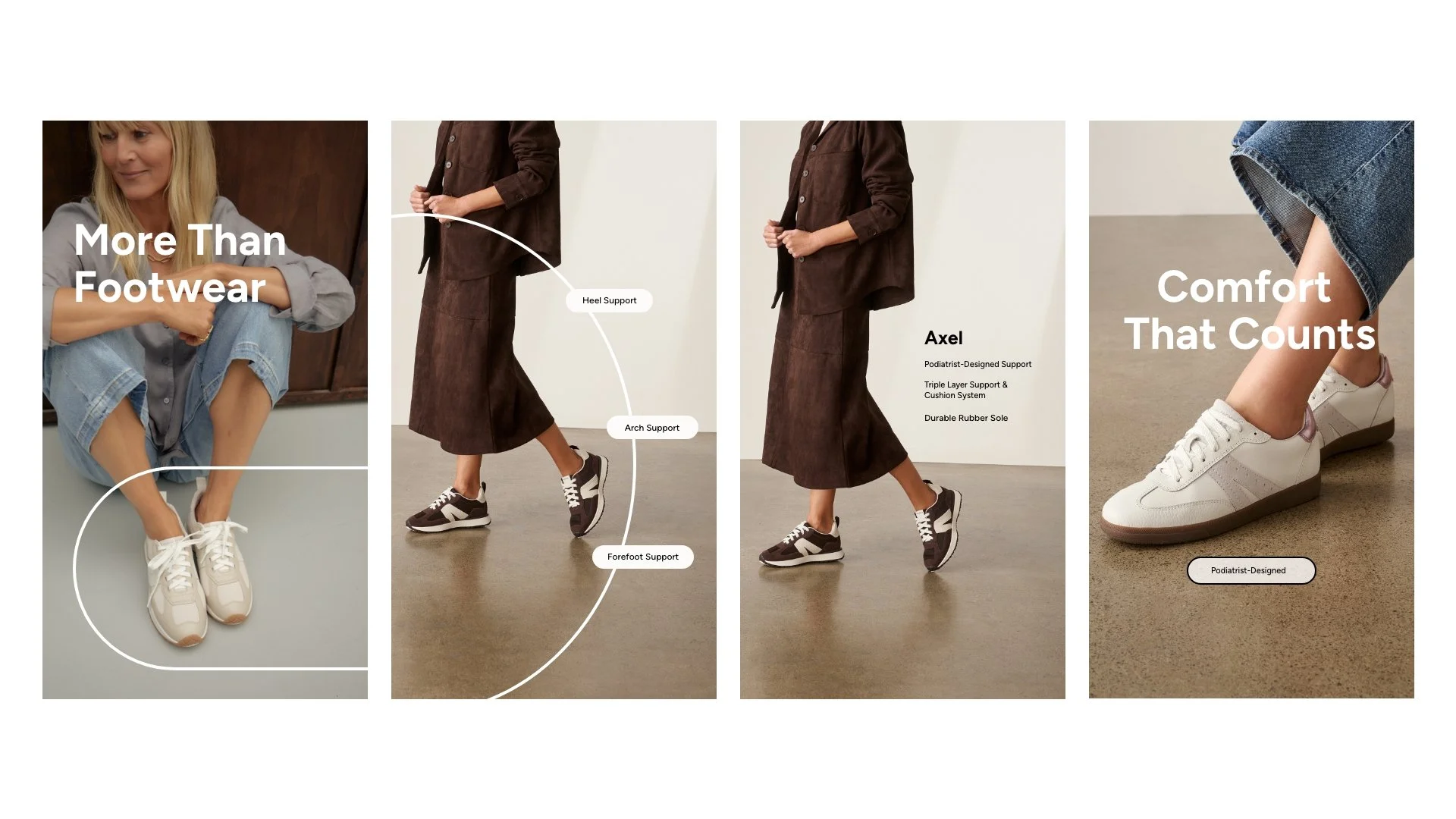
Iteration
Iteration
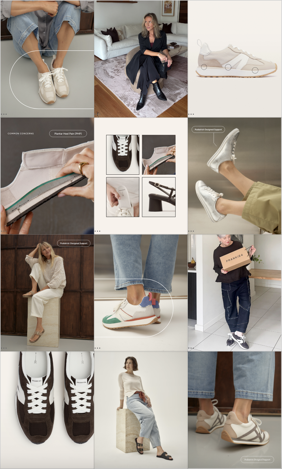
Social feed mockup
Final Templatized Examples
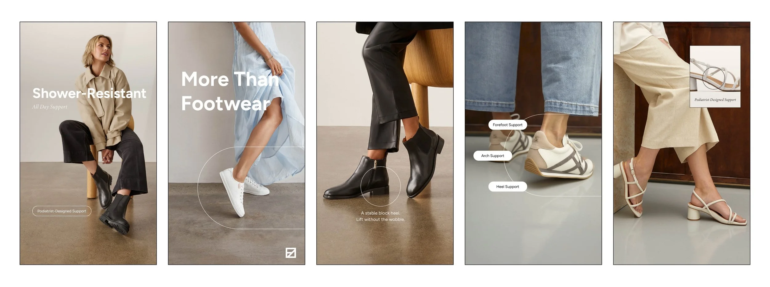
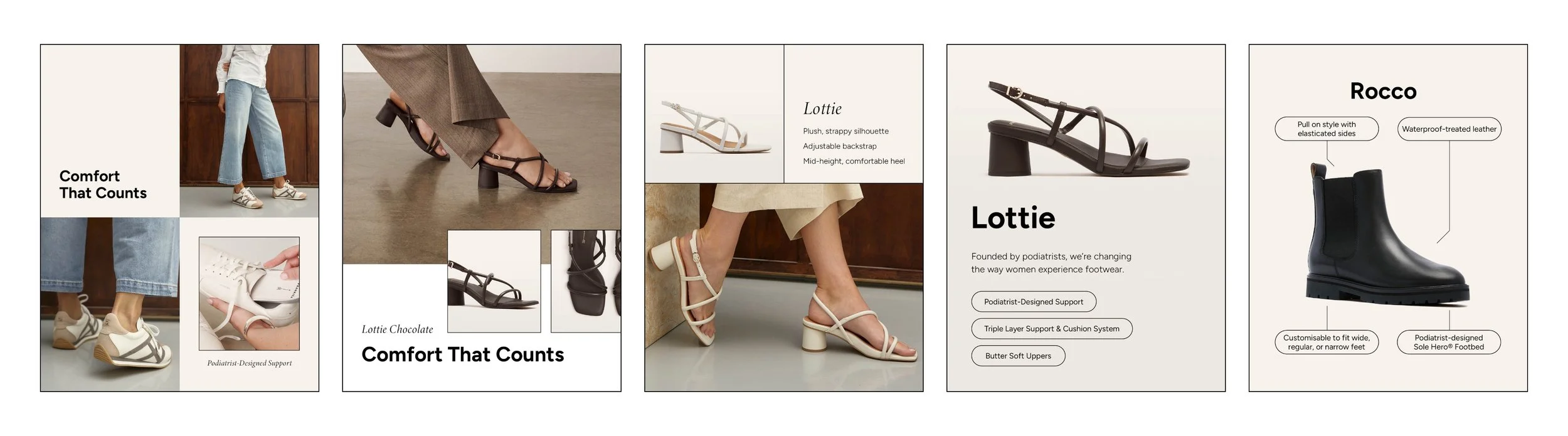
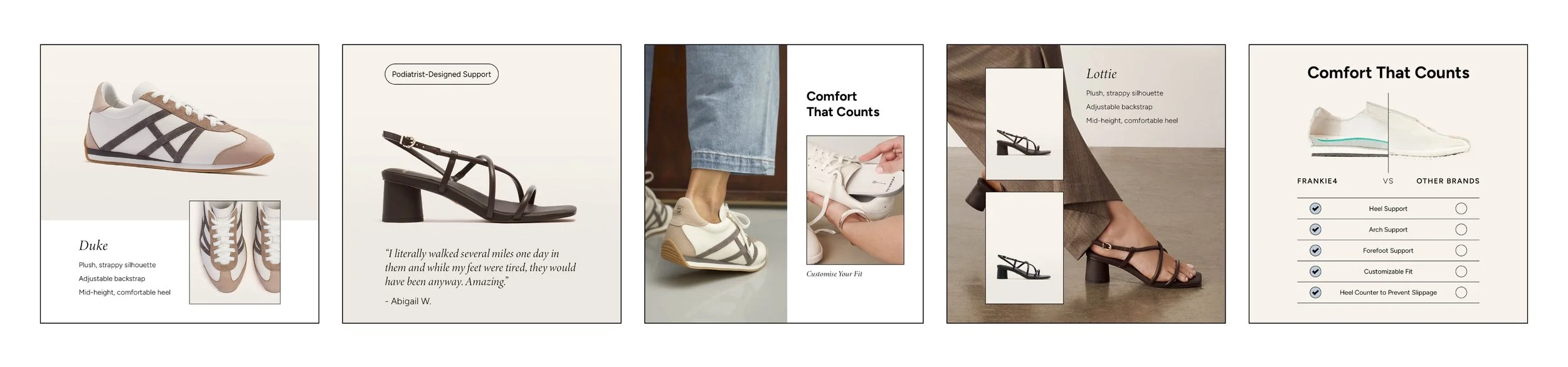
Published Marketing Assets